
Some of the links in this post are affiliate links. This means if you click on the link and purchase the item, I will receive an affiliate commission at no extra cost to you. All opinions remain my own.
Utah-based wedding vendors are competing in one of the most image-driven markets in the country, where a bride may compare photographers, planners, florists, venues, bakers, hair and makeup artists, rental teams, calligraphers, and content creators in a single evening of scrolling. The work may be deeply personal, highly skilled, and built on years of experience, but the first impression often happens before a conversation, consultation, or pricing guide ever enters the picture. In the Instagram and Pinterest era, visual branding has become the quiet filter that helps couples decide who feels aligned, trustworthy, elevated, approachable, artistic, or worth saving for later.
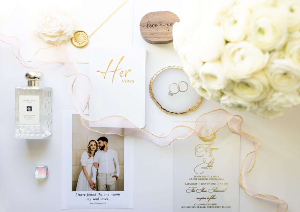
Image via Pexels
The Fast Read
A wedding vendor’s visual brand is not just a logo or a pretty Instagram feed. It is the full visual pattern brides notice across your website, social profiles, proposals, packaging, printed materials, galleries, email documents, and inquiry experience. The strongest brands do not chase every wedding trend; they make a specific kind of couple feel, “This vendor understands the kind of celebration we want.”
For Utah vendors, that matters because the local wedding scene stretches across very different aesthetics: Salt Lake City editorial weddings, Park City luxury weekends, Provo and Utah Valley celebrations, Southern Utah elopements, temple-adjacent family gatherings, mountain venues, desert landscapes, and refined backyard receptions. A cohesive brand helps the right couples recognize you faster.
What Makes a Wedding Vendor Brand Feel Cohesive?
A cohesive brand does not require everything to look identical. It requires everything to feel related. Brides should be able to move from your Instagram to your website to your pricing guide and feel like they are still in the same world.
| Brand Element | What It Communicates | Where It Shows Up |
| Logo | Professionalism, memorability, first impression | Website, social profiles, business cards, proposals, watermarks |
| Color palette | Mood, price positioning, emotional tone | Instagram graphics, website, PDFs, packaging, signage |
| Typography | Personality and polish | Website headings, pricing guides, welcome packets, menus |
| Photography style | The kind of weddings you want more of | Portfolio, Instagram grid, Pinterest, ads |
| Social grid | Taste level and consistency | Instagram, TikTok covers, Pinterest pins |
| Packaging and print | Client experience and attention to detail | Thank-you cards, floral tags, cake boxes, welcome gifts |
| Email and proposal design | Organization and trust | Inquiry replies, quotes, planning documents |
The Small Mark That Carries a Lot
The foundation of a wedding vendor’s visual brand is often the logo: a compact visual signature that appears on websites, social profiles, packaging, printed proposals, business cards, portfolio watermarks, and the branded materials couples encounter while researching. Before a bride ever speaks with you, that mark can influence whether your business feels established, thoughtful, polished, or still unfinished. For vendors who do not have a designer on retainer, tools like Adobe Express’s free logo maker to boost your brand make it easier to start with a customizable template and shape something distinctive. That kind of accessible design support can help solo planners, photographers, florists, bakers, and other small wedding businesses build a visual signature that feels intentional enough to support a cohesive presence across the places Utah brides are already looking.
Choose the Aesthetic That Attracts the Right Weddings
The biggest branding mistake in the wedding industry is copying an aesthetic because it is popular rather than because it matches the work you want to book. A moody editorial brand may look beautiful, but it might not attract the warm, family-centered, garden-party weddings you actually love. A soft romantic palette may feel safe, but it may not position you well for fashion-forward downtown celebrations or luxury Park City weekends.
Start by looking backward before you look sideways. Which past weddings made you think, “I want ten more like this”? Which clients trusted you, valued your process, and shared your taste? Which venues, colors, budgets, timelines, and creative choices brought out your best work?
A good brand aesthetic should answer three questions: What kind of wedding do we want to be associated with? What kind of client makes our work better? What visual tone helps that client recognize us quickly?
Here are a few useful direction markers:
- Classic and refined: serif type, restrained colors, clean layouts, elegant imagery, minimal trend dependence.
- Romantic and organic: soft palettes, floral textures, natural light, tactile paper goods, graceful spacing.
- Modern editorial: bold typography, high-contrast imagery, negative space, fashion-inspired cropping.
- Playful and colorful: expressive palettes, whimsical graphics, energetic layouts, personality-forward copy.
- Earthy and destination-driven: warm neutrals, landscape imagery, natural textures, documentary-style visuals.
The right answer is not the trendiest one. It is the one that helps your best-fit client self-select.
A Simple Brand Alignment Check
Use this quick process before changing your visuals:
- Name your best-fit wedding type. Be specific: luxury mountain wedding, colorful backyard celebration, refined temple-adjacent reception, desert elopement, downtown editorial event, or another clear category.
- Audit your last ten inquiries. Look for patterns. Are people asking for the work you want to do, or are your visuals attracting mismatched budgets, styles, or expectations?
- Compare your top five touchpoints. Review your Instagram grid, website homepage, pricing guide, inquiry email, and proposal document. They should feel like one brand, not five separate businesses.
- Remove visual noise. Retire fonts, colors, templates, icons, and filters that do not support the aesthetic you want to be known for.
- Create repeatable rules. Decide how you use your logo, what colors appear most often, what fonts belong where, how images are cropped, and what your client-facing documents should look like.
- Test for recognition. Ask whether someone could identify your brand without seeing your name. If the answer is no, your visual system needs more consistency.
A Local Place to Watch for Visual Direction
One useful resource for Utah wedding vendors is Utah Valley Bride, which publishes local wedding inspiration, vendor features, planning content, and preferred vendor resources. The site describes itself as a source for wedding inspiration, local vendors, and expert advice for Utah Valley weddings, making it a helpful place to observe how local couples are being visually educated before they inquire. For vendors, the value is not in copying what appears there. The value is in noticing patterns: which venues get featured, what color stories are recurring, how photographers frame details, how florals are styled, and what kinds of wedding aesthetics are being normalized in the local market. Treat it as a listening tool, not a mood board to imitate.
FAQ
Do wedding vendors really need a polished visual brand before they are fully booked?
Yes, but “polished” does not have to mean expensive or elaborate. It means consistent, clear, and appropriate for the clients you want. A simple brand system that repeats well is better than a complicated one that falls apart across platforms.
Should Utah vendors follow national wedding trends?
National trends can be useful for awareness, but they should not override local positioning. Utah weddings often blend family traditions, religious or cultural expectations, outdoor scenery, seasonal venue constraints, and destination-style landscapes. Your brand should reflect the weddings you want to attract, not just what is trending on a coastal planner’s feed.
What is the fastest way to make a brand feel more cohesive?
Start with your most visible touchpoints: Instagram profile, website homepage, logo, inquiry email, and proposal PDF. Use the same colors, type style, tone, and photography direction across those assets. Couples should not feel a visual drop-off after they move from inspiration to inquiry.
How often should wedding vendors update their branding?
A full rebrand is not needed every year. Instead, review your brand once or twice a year and ask whether it still matches your best work, pricing, client experience, and desired bookings. Small refinements often work better than constant reinvention.
The Long Game: Branding as a Quiet Client-Attraction Engine
The best wedding vendor branding does not scream for attention. It compounds. Every post, proposal, gallery, thank-you note, vendor collaboration, and styled shoot becomes part of a recognizable pattern. When that pattern is clear, brides begin to understand what you do before you explain it. Planners remember where to place you. Venues can picture which couples would love you. Past clients recommend you with better language because your brand has already taught them how to describe you. That is when branding stops feeling like a self-promotion chore. It becomes a steady attraction system.
Utah wedding vendors do not need to look like everyone else to compete visually. They need a brand that makes the right couples feel immediate alignment. Start with the essentials: a strong logo, consistent colors and type, a recognizable photography direction, and polished client-facing documents. Over time, those choices build the kind of trust that turns a quick grid scroll into a serious inquiry.
